Styling forms with CSS
I spent lots of time designing forms and trying to make them look good. It’s a
tedious process, usually involving a bunch of <div>, <ul>, <p> tags, and
even tables, with lots of CSS.
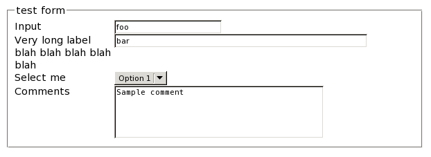
But now I found a way of making nice forms like this one:

The HTML code is straightforward:
<fieldset>
  <legend>test form</legend>
  <label for='input'>Input</label><input name='input' id='input'>
  <label for='input_long'>Very long label blah blah blah blah blah</label>
    <input name='input_long' id='input_long' size='50'>
  <label for='select'>Select me</label>
    <select id='select' name='select'>
      <option>Option 1</option>
      <option>Option 2</option>
      <option>Option 3</option>
    </select>
  <label for='comments'>Comments</label>
    <textarea cols='40' rows='4'>Sample comment</textarea>
</fieldset>
No <div>, <ul>, or <br> floating around. I think there is nothing to remove. The
CSS code is equally simple:
label
{
  float: left;
  clear: left;
  width: 10em;
}

input, select, textarea
{
  float: left;
}
Simple and it does the job. I didn’t test it on Internet Explorer 6 and Netscape Navigator 4, just because.